Beuchat Diving Equipment
Brand design
Client
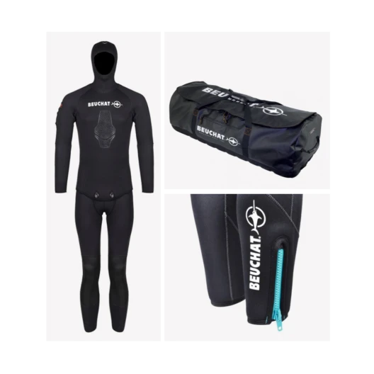
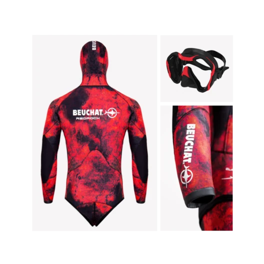
Beuchat International, or simply Beuchat, is a French company founded in 1934 in Marseille, specializing in the design, manufacture and sale of underwater equipment.
Keywords
Logotype / DA / Brand identity / Diving Equipment / Sport
Goal
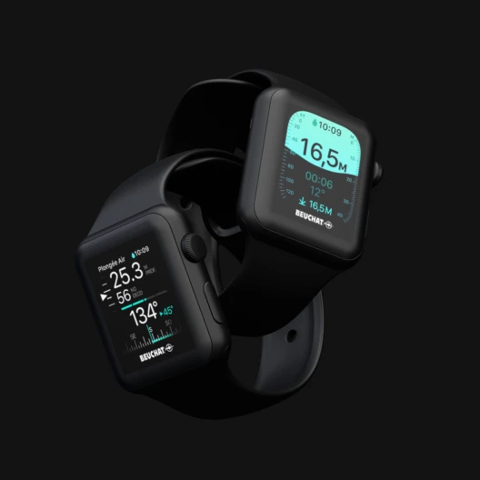
The logotype had many defects for industrial use (engraving of injection molds, screen printing, embroidery, digital for computers and diving instruments), as well as for digital communication.
Solution
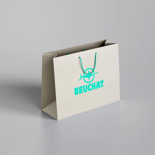
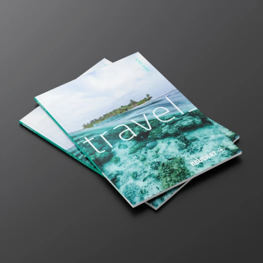
The acronym, representing a swordfish, has been completely redesigned and reversed. The Antique Olive typography has been replaced by a more modern and readable sans-serif font. A charter of use was created, accompanied by a secondary font. The color palette was also enriched. Overall, the brand identity was updated.