Olympique de Marseille
Branding
Client
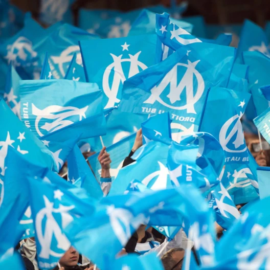
Olympique de Marseille is a French football club founded in 1899 and located in Marseille.
Keywords
Branding / OM / Soccer club / Logotype / Sport
Goal
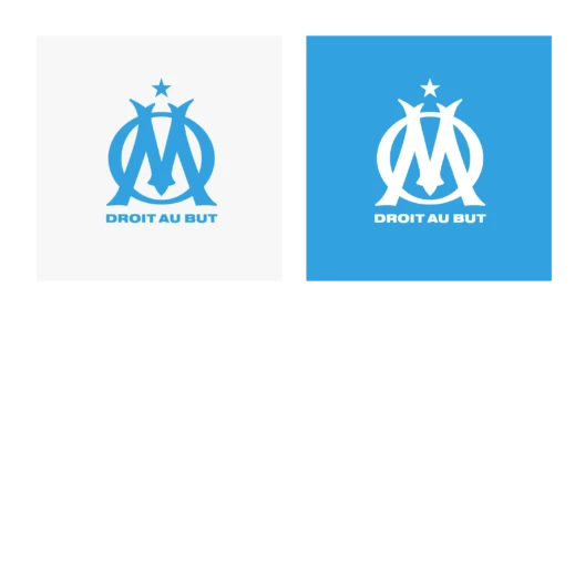
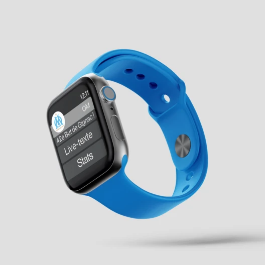
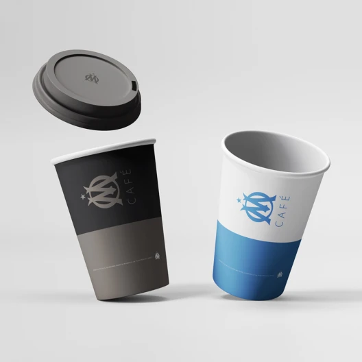
The club’s logo needed improvement, particularly for aspects of readability, reproducibility and digital use.
Solution
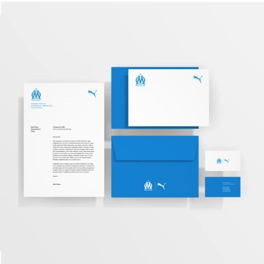
The new acronym is in perfect cohesion with the heraldic spirit of the previous versions. Its refined design gives it very high readability and ease of use on all media, even in extreme reductions. The outline has been removed, and the number of counter-forms has been reduced from 13 to 4, with the exception of the motto “Straight to the point”. The colors remain the same: the azure blue and white of the coat of arms of the Phocaean city, with a blue slightly warmed by the addition of magenta.