Ernerplan
Brand identity
Client
Enerplan is a national and interprofessional employers’ union in the solar energy sector, bringing together members from the industrial, construction, trade and service industries.
Keywords
Solar energy / Branding / Fintech / Identity / Signage
Goal
The brand identity, created 40 years ago, needed to be updated to better meet the current challenges of the sector and adapt to new digital uses.
Solution
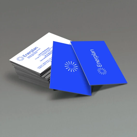
The new brand identity maintains a predominantly blue color palette, a symbol of serene authority and competence. The brighter blue selected brings more dynamism and modernity. The second color, a buttercup yellow, is chosen to add a solar touch. The icon, a sun, is the simple rotation of a ray at 360°. The selected typography, Open Sans, is characterized by its geometric and refined appearance, giving the identity a modern and readable style.