Maison Close
Brand design
Client
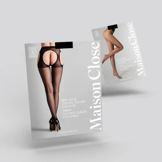
Maison Close is a French lingerie brand.
Keywords
Brand identity / Web design / E‑commerce / Digital / Branding / Packaging / POS / Stands
Goal
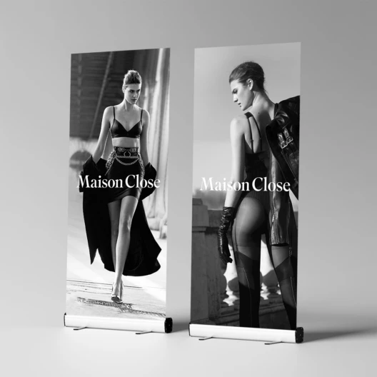
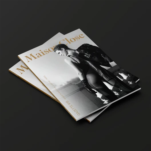
The previous graphic identity had to be modernized and adapted to a new era of online shopping experience and better communicate the brand’s universe and the diversity of its product ranges.
Solution
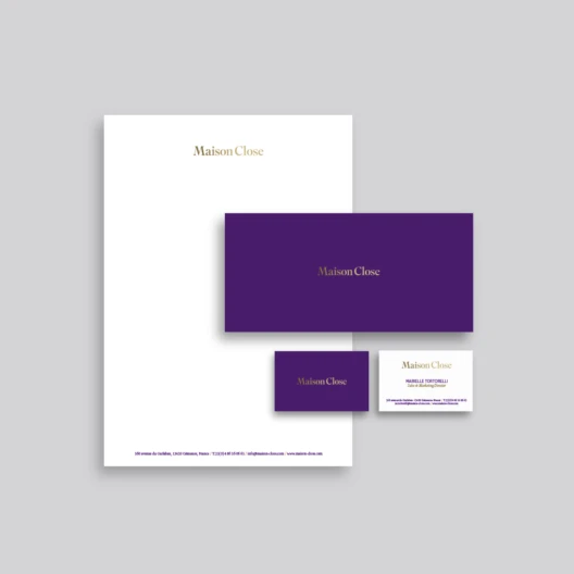
The new brand identity pays homage to the previous guidelines. It was essential to keep the color palette, mainly composed of purple, black and gold, representing the brand’s DNA. The selected typography, Superior Title, is a high-contrast transitional font, a missing link between Bodoni and Times. This family is inspired by American titles from the early 20th century. Modern and legible, it supports reduction well and can be used in hot metal printing as well as in casting or on textiles.